Types of headers in Editor 2.0
/Headers
A static header remains fixed at the top of the page but only appears when the visitor is at the top of the page. Once the visitor scrolls down, the static header moves out of view along with the rest of the content. It does not remain visible as the user scrolls.
1. Static header
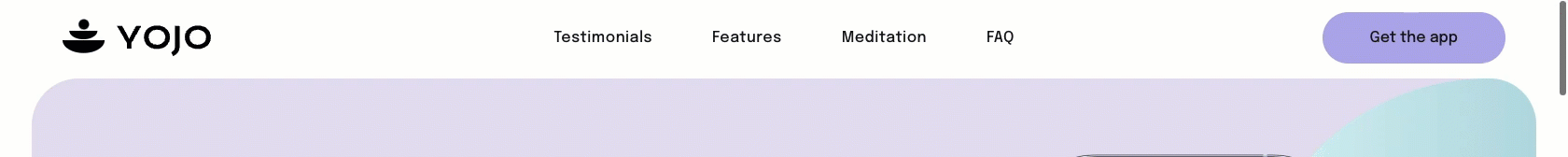
A static header is most effective in scenarios where the primary goal is to minimize distraction and guide the user toward content consumption or to fulfill a specific action.
Set up a static header
To set up a static header, click on the Header. In the design panel, expand the Position property, ensure the toggles Overlap 1st section on page and Set as sticky header are off.
Design tips
Tip 1: Minimalist design
Keep the design simple and uncluttered since this header will only be visible when users are at the top of the page. Highlight essential elements like your logo and primary navigation.
Tip 2: Use contrasting colors
Ensure the header stands out against the background of your site’s first section to make a strong initial impression.
Use Cases
The application of a static header is best suited for the following types of websites:
- Content-heavy websites: Blogs, news sites, or academic journals. The primary objective is to read. A static header supports this by providing initial branding and navigation and then retreating to allow for an uninterrupted reading experience.
- Landing Page: A landing page is designed with a single, clear goal in mind: guiding a visitor toward one specific action, whether it's signing up for a newsletter, downloading a guide, or making a purchase.
2. Sticky header
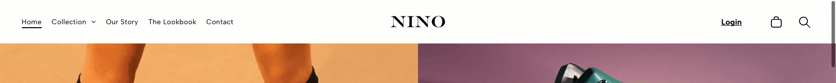
A
sticky header remains fixed at the top of the page even as the user scrolls down the page. This ensures that key navigation elements are always within reach.
Ideal for websites with extensive content where users need constant access to navigations. It’s also great for e-commerce sites to keep the shopping cart and key actions accessible.
Set up a sticky header
To set up a sticky header, click on the Header. In the design panel, expand the Position property and enable the Set as sticky header toggle.
Design tips
Tip 1: Prioritize key elements
Only include essential items like navigation, contact information, or a call-to-action button, as the header will be visible throughout the entire browsing experience.
Tip 2: Maintain legibility
Ensure the text and buttons remain clear and readable as users scroll, considering different screen sizes and potential background changes.
3. Shrinking header

A
shrinking header, also known as a dynamic sticky header, remains fixed at the top of the page even as the user scrolls down the page. However, it starts larger and more prominent and then reduces in size as users scroll down. This design helps save space.
Perfect for sites where you want to maximize screen real estate but still need to keep navigation accessible. It’s especially useful for sites with long pages or extensive content.
Set up a shrinking header
To set up a shrinking header, click on the Header. In the design panel, expand the Position property and enable the Set as sticky header and Change header on scroll toggles.
To customize the shrink behavior:
- In the Spacing property of the header’s design, define the initial spacing of the header by setting the header’s initial padding-top and padding-bottom values.
- Then, in the Position property, define the scroll behavior by configuring the following design options:
- BG on scroll. Select the background color and opacity.
- Spacing on scroll. Set the Spacing on scroll values for padding-top and padding-bottom to be smaller than the header’s initial values.
- Logo size. Use the slider or text box to specify the size the logo shrinks to when the header shrinks on scroll. The default is 66%.
Design tips
Tip 1: Optimize logo size
Set an appropriate size for the logo to ensure it’s visible and maintains brand recognition even when it shrinks.
Tip 2: Consider spacing
Balance the header’s top and bottom padding with the spacing on scroll to create a smooth shrinking effect without crowding the content.
4. Hidden header
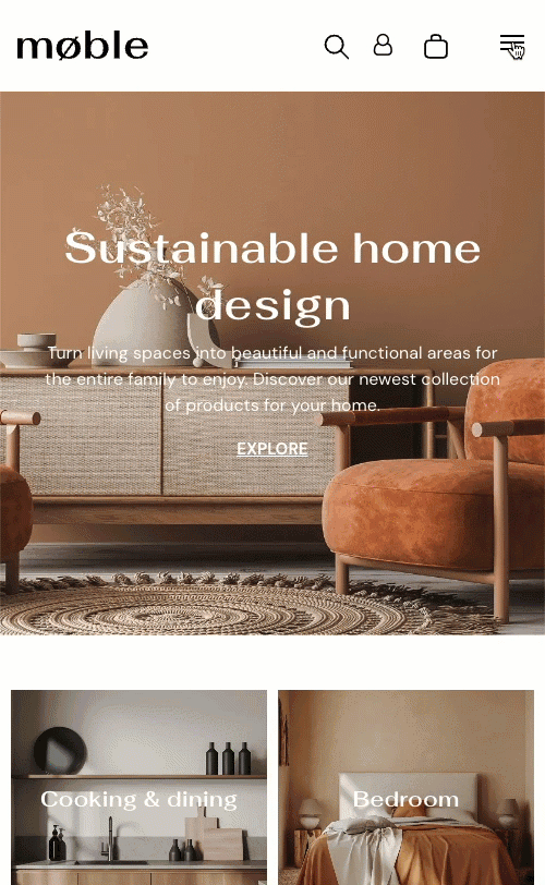
A
hidden header is not visible by default and appears only when triggered by a user action, such as clicking a hamburger menu button.
Ideal for minimalist designs where you want to keep the header out of view to reduce visual clutter but still provide access when needed.
Set up a hidden header
To set up a hidden header, click on the Header. In the design panel, expand the Presets property. Choose a preset layout that best fits your design. Currently, the hamburger menu button is only available on tablet and mobile device layouts.
Design tips
Tip 1: Hide for minimalism
Use hidden headers on pages where you want to maintain a clean, immersive experience, such as landing pages or media-heavy content.
Tip 2: Provide alternate navigation
If the header is hidden, make sure users have another clear and accessible way to navigate, such as a sticky sidebar or footer menu.
5. Overlapping header on first section

An
overlapping header seamlessly merges with the first section of your website, creating an integrated design.
Use an overlapping header on first section when you want to blend the header with a large hero image or video, creating a bold, immersive visual impact while maximizing screen space.
Set up an overlapping header
To set up an overlapping header, click on the Header. In the design panel, expand the Position property and toggle on Overlap 1st section on page. Then, select the header overlap background color and opacity.
Design tips
Tip 1: Use transparent backgrounds
Consider using a semi-transparent or transparent background for the header overlap to create a seamless blend with the first section’s content while maintaining readability.
Tip 2: Adjust content placement and settings
Ensure the first section's content doesn't interfere with the header elements by testing across different screen sizes. If you use a sticky header, consider enabling the Change Header on Scroll option and setting a distinct background color upon scrolling. Keep key elements like the logo and navigation clear and distinct for better usability.