The Design Panel
/MEET EDITOR 2.0
To open the Design Panel, click any element from the Canvas. From the floating bar, click Edit Design. The Design Panel will open on the right side of the editor.
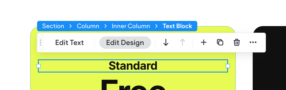
The Design Panel appears on the right side of the editor and displays the design properties for the selected element, whether it's a Section, Column, Widget, or Layout Element (Inner Column and Advanced Grid).
Each element type has its own set of adjustable properties, so the options in the panel will change depending on what you've selected. These properties may include alignment, layout, spacing, sizing, and more.
You can collapse or reopen the Design Panel using the small tab located on the right edge of the editor.
Note
Design styles automatically cascade from the main Desktop breakpoint to all other device breakpoints (like Tablet or Mobile). However, if you apply a style directly on a specific breakpoint, that style will override the cascading Desktop style for that element.
In other words, styles flow downward from Desktop
until you make a change on another breakpoint. Once a style is applied at a specific device level, it becomes independent from the Desktop version for that style property.
We’ll cover this in more detail later in the course
Breakpoints for Responsive Design, where you’ll learn exactly how styling works across different devices.